
Is Bitcoin's next shock weeks away?
2-year rolling OLS r² makes a pretty... odd pattern.

As we’ve covered before…
Bitcoin’s long-observed behavior is a power law. The exponent is the slope. r² is how well the data describes the structure. Structural integrity is how we describe whether that relationship is still intact.
We showed how you can measure structural integrity over 2-year and 4-year rolling windows, where we focused on plotting the rolling exponent (the β from that same sliding log–log OLS). Those charts revealed how aggressively the short window moves versus the longer one, and how both oscillate around the long-run attractor (5.65).
Most recently, we went deeper in Is regime shift on the way?, where we introduced the velocity of the 2Y curve to see whether the 2Y rolling exponent is starting to slow.
With all this focus on the exponent, we wanted to start plotting r² on the same rolling OLS timeframes.
We got one of the strangest charts we’ve seen yet.
The weird r² plot — “Scaling Shock”
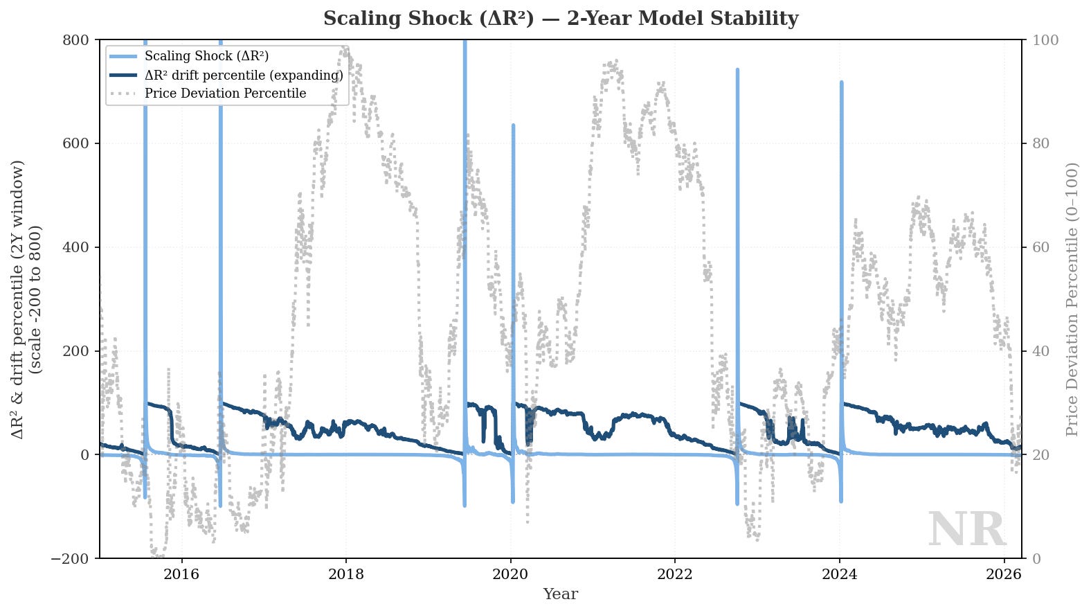
This is busy, so let’s break it down:
The light blue series we’re calling “Scaling Shock (Δr²). This is the one-day change in rolling 2Y r². When that line spikes, the goodness-of-fit of the two-year window just moved hard.
The dark blue series ranks that daily shock against all history to date (an expanding percentile). It gives perspective into how extreme today’s jump in 2Y fit instability was versus the full dataset.
The grey series is price deviation percentile. This is where spot sits versus the long-run implied price from the structural attractor (5.65), expressed as a percentile over time (phew).
When the two-year window stops behaving like one segment, Δr² and its percentile are usually the first to move. This dislocation in fit marks a potential regime transition.
If we smooth this signal, we can get a better read for persistence: a Regime Instability Score.
Isolating Regime Instability Score (RIS)
Regime Instability Score (RIS) is the absolute one-day move in 2Y r², with a 14-day span. RIS helps us understand how large have scaling shocks been, and how persistently.
Important: RIS is not “direction”, but the measure of the 2Y scaling shock.
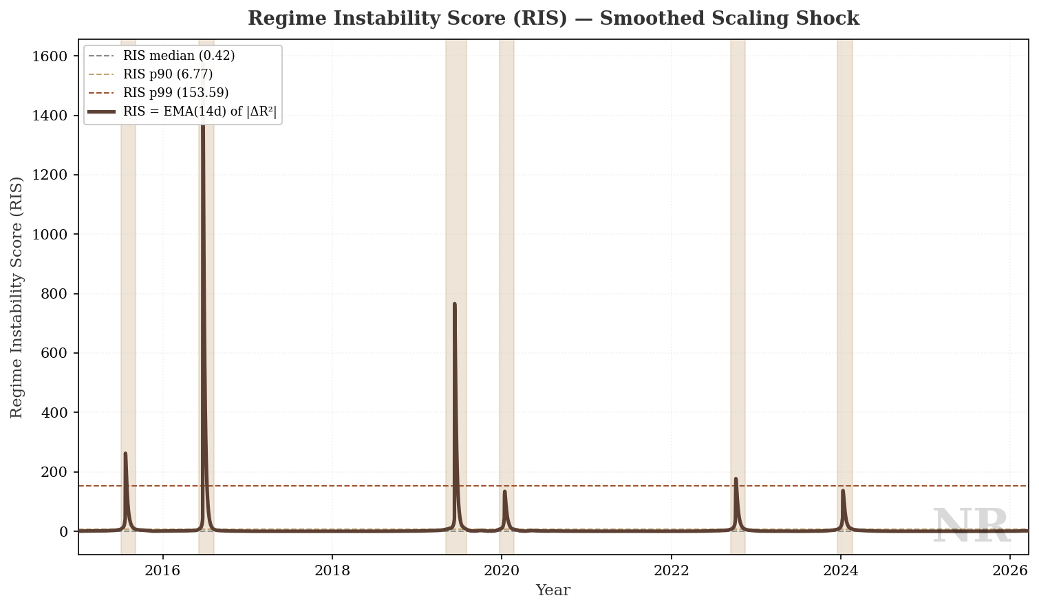
On the chart, median / p90 / p99 bands are reference rails for typical / elevated / extreme for this metric. When RIS clears the sample p90 band, the chart uses a full-height background to visually flag the shock.
Bringing it back together
Okay, so we have a way to spot rare r² dislocation over a rolling two-year window. What can we do with it?
The picture comes together when we bring back price deviation and the 2Y rolling exponent percentile.
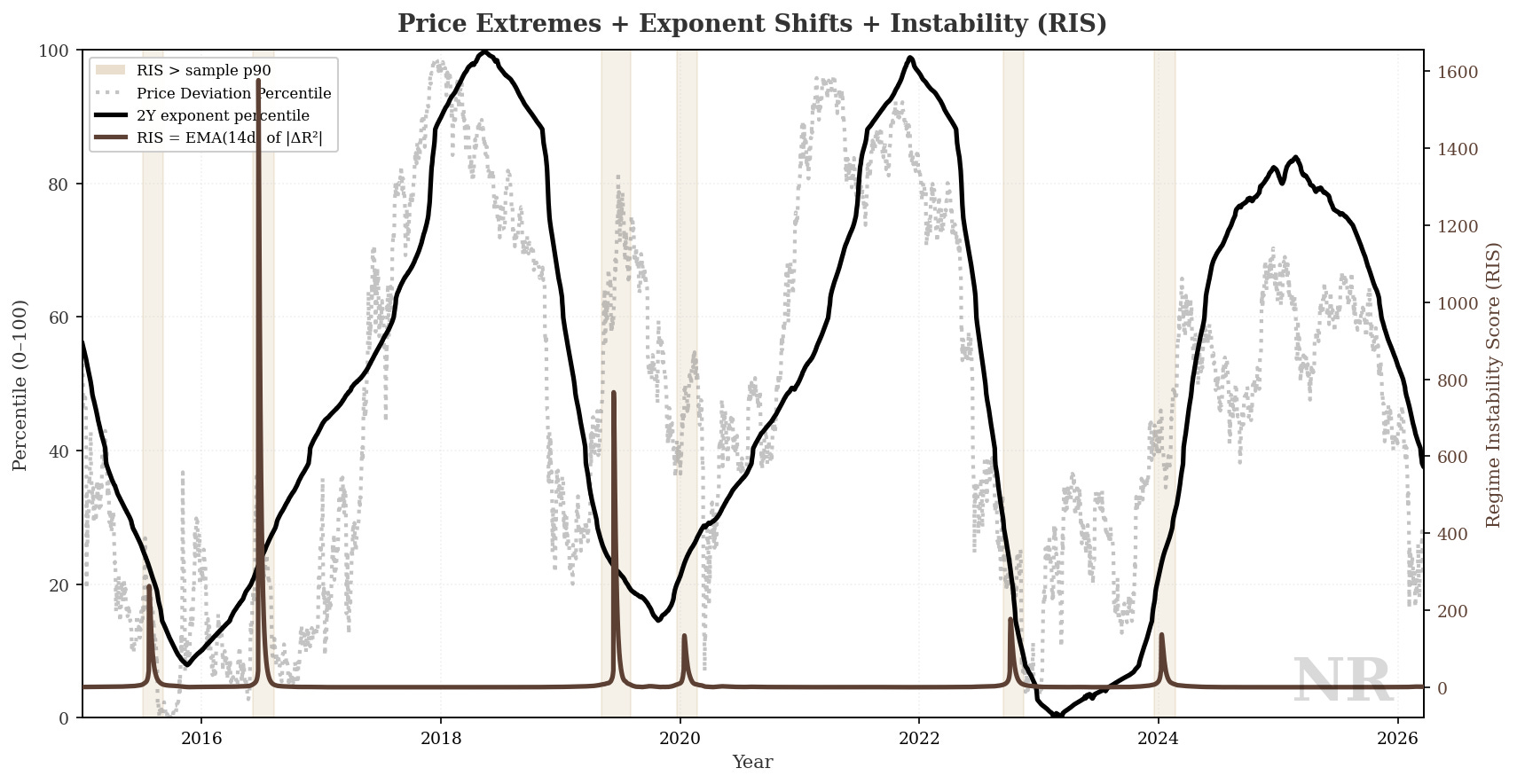
Again, breaking it down:
The left scale tracks two percentile series: price deviation percentile and the 2Y rolling exponent percentile.
The right scale tracks RIS.
The gold shading marks periods when RIS is above its sample 90th percentile — in other words, when the two-year fit has been unusually unstable in smoothed terms.
What we notice, in several well-known eras, is RIS spikes lining up with stretches where exponent percentile and deviation percentile are also doing extreme work.
We are not claiming a formal causal model here, only visualizing the correlation in the data between fit instability, short-window slope state, and cheap vs rich vs implied.
What do you think happens next? Stay close to this research, and let’s see whether another turbulent stretch shows the same rhyme in the data.
Fewer surprises usually come from watching structure, not from timing headlines.
Hey! Would you consider subscribing? It helps keep you updated with the latest observability, receive the latest experiments, research, and support more of our work. Thank you!